Saturday, April 28, 2012

Environmental Interface

For our final project we were assigned to design an environmental interface for a space outside the UNCG Music Building. The site is located in on W Market Street in front of the music building and adjacent to the vegetation leading into Peabody Park. Our goal was to design a interface that would interact with pedestrians and motorists while creating a interface between UNCG and the Lake Daniel Neighborhood.

My design process began with deciding on a concept, twist. My first design idea came to me when I was playing around with a bundle of wire and stretched it out to form the shape you can see in the pictures to the left. My decision to go with a colored top came from thinking about where the sun would be located throughout the day. The sun would be located behind the walkway the idea of creating a reflection of color onto the sidewalk I felt would really engage the pedestrians.
             
To the engage passerbys even more I chose to try out the idea of bringing the metal across the sidewalk. Doing so created a conflict with the cover because there was no room for it. So I brought the colors from the top to the bottom and changed the material of the sidewalk from normal cement to colored cement which will also add a texture change and emphasize the idea of walking through a new section to the music building. I thought this design was successful, but wanted to push myself farther by creating a even more engaging design.


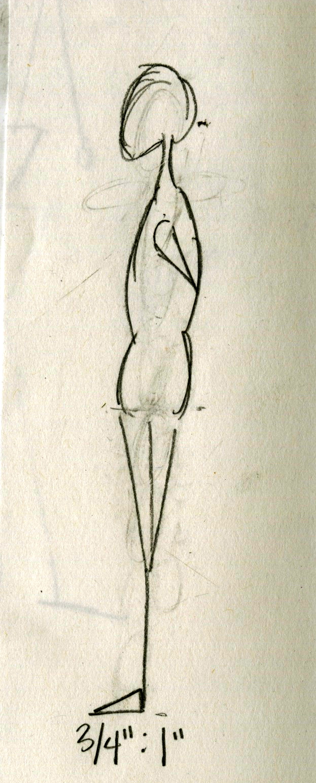
 In a moment of frustration I balled up my metal structure and gave up for a minute on the question of "what do I do now?" After staring at the mess I made of my project I noticed the continuous circles and overall very interesting shape it created. So of course I glued it down to the cardboard and connected the two metal structures together by weaving a piece of orange fabric between the two. Puzzled with the colored sidewalk I tried gluing it down underneath the structure I created and fell in love.  I am so pleased with the outcome of my design. It meets all the needs by engaging the pedestrians and anyone who happens to pass by while creating a interface to the Music Building and Peabody Park.
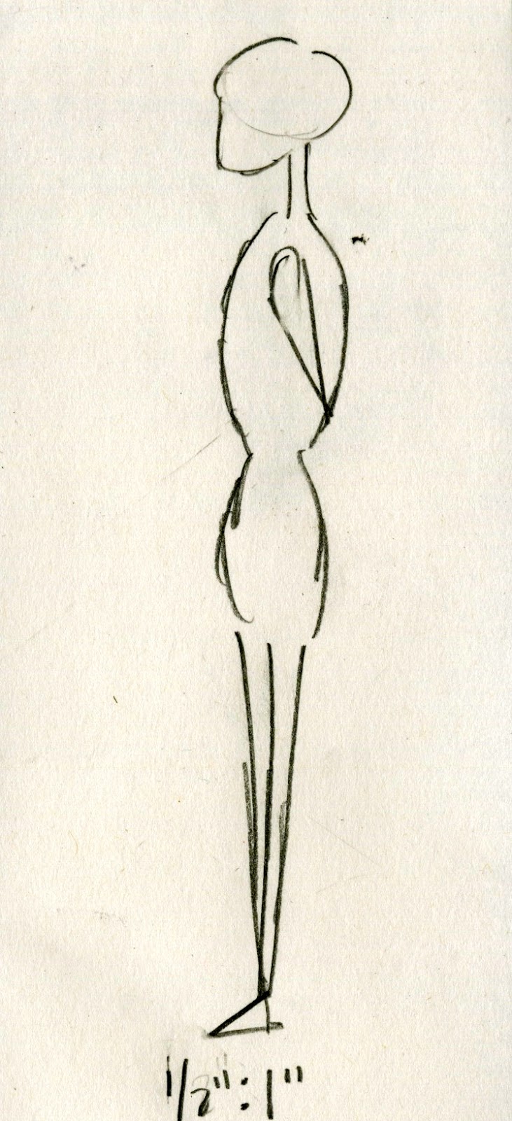


Thursday, April 26, 2012

The Body: Scale Figures


In the kitchen with Karyn-Perspectives


In the kitchen with Karyn-Floorplan and Section


Values of Fallingwater


Self Portrait


For the last design activity we were assigned to take our object and select a class members object and combine them to make a new and innovative object. I took my object (peacock pillow) and Emily Febrizio's object (oxford shoe) and created a peacock shoe. As you can see above there are peacock feathers sticking out of the back and a head in the front I kept the original design of the oxford shoe. This invention is definitely not one I have seen before and I feel could be very fashionable.

Monday, April 23, 2012

Unit Summary 3

Modernism is a huge part of today’s generation. Modernism began around the time of the World Fairs. The World Fairs showed evidence that design was finally progressing. Design was moving past old trends and branching out into something entirely new. Designers were acting on their ideas and inspirations and communicating those ideas through architecture. The World Fairs were celebratory events that designated modifications in the world. They were commercial events, but also very competitive because designers competed to be a part of them. World Fairs introduced and promoted new up and coming products such as, Cracker Jack’s, Aunt Jemima, and Wrigley’s Gum. By promoting new products and designs, the World Fairs influenced people to travel around the world. 


 The search for modern design was not a simple task.  Designers chose to repeat classic design while the post impressionistic focused more on light. Cubism, flattening out of a space, was introduced, as was expressionism. The idea of combining flattened space with more emotions. Finally, art nouveau, made its debut and modernism hits its highest. Modernism is the first design style without a historic precedent and grew tremendously fast.


 Casa Batilo by Antonia Gaudi
During the 19th century, designers were starting to be “done with” reform. Finished with making the old “new.” Designers wanted new forms, focusing on modern they struggled trying to find a trend to settle in. Before Modernism, design styles always had a specific trend. But modernism is the exact opposite. It was a bunch of designers ideas compiled into all designs. Designers would copy, reinvent, and mix together several different designs. Louis Sullivan would natural materials and put them into abstract geometric patterns. Modernism started with interiors and with time moved to include the exteriors of buildings as well. 

 The Crystal Palace, 1851, iron and glass
 The Eiffel Tower, 1889
  
Frank Lloyd Wright was a leading architect for modern architecture and one of the best examples. Wright would give as much care to the interiors of his designs as he did to the exteriors. Most of his floor plans were very smooth and incorporated straight, clean, horizontal lines. 

 Frank Lloyd Wright, The Guggenheim
 Frank Lloyd Wright, Falling Water

 
PHOTO CREDIT:
http://en.wikipedia.org/wiki/World%27s_fair
http://vintagraph.com/worlds-fair/single-gallery/2509333
http://sastha-knowyourledge.blogspot.com/2011/11/wrigley-fun-facts.html
http://www.destination360.com/europe/spain/barcelona/casa-batllo
http://passport2design.com/chaotic-design-can-be-beautiful/ 
http://tlc.howstuffworks.com/family/eiffel-tower-landmark.htm
http://en.wikipedia.org/wiki/The_Crystal_Palace
http://www.wright-house.com/frank-lloyd-wright/fallingwater-pictures/F1SW-fallingwater-in-fall.html
http://www.guggenheim.org/new-york/about/frank-lloyd-wright-building

Tuesday, April 17, 2012

Blog Post 13


Modern homes can be classified by clean lines and simple proportions. Many modern homes today look back at the traditional and practical design of adobe style homes, large windows, outdoor patios, swimming pools. Modern homes are built using environmentally friendly materials and are sustainable.

PHOTO CREDIT:
http://www.modernn.com/

Monday, April 16, 2012

Chair Card Extra Credit


Reading Response 13


PHOTO CREDIT:
http://thebesttraveldestinations.com/sydney-opera-house/
http://targetaustralia.blogspot.com/2010/12/sydney-opera-house-open-day.html
http://worldsincredible.blogspot.com/2011/06/sydney-opera-house-australia.html

Sunday, April 8, 2012

Reading Response 12


PHOTO CREDIT:
http://designapplause.com/2010/farnsworth-house-revisited/7651/
http://www.preservationnation.org/magazine/2004/july-august/ja04feature2.html

Design Activity 3


The pillow I had chosen as my object could develop into much more then just a pillow. The sequins on the pillow could cover a whole pillow, the lace could become a doily, and the idea of a pillow itself could become a chair. The ideas used in the design of the decorative pillow could have a impact on how designers combine different material types together on future upholstery.

PHOTO CREDIT:
http://www.techpin.com/top-5-sound-embedded-gadgets/
http://theprettybee.blogspot.com/2010/06/diy-doily-wall-art.html
http://www.sabiracollection.com/zia.html
http://www.jpfun.com/patterns/free/pillows/f119001travelpillow.shtml
http://www.flickr.com/photos/21239422@N08/favorites/page5/?view=lg

Saturday, April 7, 2012

Blog post 12


I feel the Google logo envelopes good design for all. Today, it is possible for something to succeed as good design simply by justifying its purpose proficiently. Google's logo is recognized for its hazardous font and the tiny illustrations for the holiday logos that mark special occasions around the world. To me, the illustrations and special reminders Google provides us with make us think more fondly of the Google name. Which with that I can say, "job well done."


PHOTO CREDIT:
http://www.mygreatiphone.com/reviews/google-translate-hits-the-app-store/

Tuesday, April 3, 2012

Unit Summary 2


This past unit was about reverberations. Rules were broken because of the reflections on the ideas of previous architecture. Styles after styles began to originate, but they did not stick in design so they can't truly be called styles. Rules that were created were broken immediately and many different ideas were experimented with.
    
The period began with the development of churches. This progression created expressions of faith through different materials such as, glass and stone. The form, space, and material that shaped let the eye move about the designs, grabbing the light and layers that are entangled into the architecture. Religion was very significant during this time, which resulted in the construction of churches more common. Designs that involved arches and lighting became the most dominant churches. The high ceilings of cathedrals were an extreme modification from the earlier churches. The towering ceilings resulted in the invention of the flying buttresses for additional support. 

 Florence Cathedral


Western design proposed that cathedrals would be the focus of the city. The cathedral would be the key structure in the cities skyline. The buildings throughout the city repeated the same form and structure that was in the cathedrals design. The material on the cathedrals would be more detailed on the front then behind.  The eastern designs had the same main concept, but the detailing was different. The western design influence opened the changes to the design of new buildings. But instead of ripping down the existing structures, they exchanged the parts they felt needed the transformation. 

 Palazza de te


When the layers began to multiply the rules began to breakdown.  Architecture began to look more staged and the Renaissance style was created. It was Individualistic, a architecture style that was not like any other, it was tranquil and peaceful. Soon after Renaissance, the Baroque style of architecture became popular. Baroque was classified as being theatrical and looked difficult to produce. The elements put into the Baroque style gave it the illusion of movement. The designs were built on an axis and instead of using one architect they used many different designers.

 Chateau de Chanonceau
After Baroqe, came the revolution, architecture and design went wild. Architects started to take a more systematic approach to architecture. Log cabins were introduced and landscapes began to contend with the main structure. The outside was balanced and brick became a new material. 

This unit, reverberations, taught us that design is everywhere and that rules were broken to obtain the modernistic approach we currently see today. 


  PHOTO CREDIT:
http://en.wikipedia.org/wiki/File:Florence_Cathedral,_front_view.jpg
http://www.all-art.org/Architecture/15-17.htm
http://en.wikipedia.org/wiki/Ch%C3%A2teau

Monday, April 2, 2012

Blog Post 11

The Bechlter Museum of Modern Art is located in Charlotte, North Carolina and fits the idea of present day modernism. This building is essentially designed to house 20th century modern art. This building is modern, sleek, and interactive. A key design element in the four story structure is the soaring glass atrium that extends through the museum's core and diffuses natural light throughout the building. The vaulted skylight system and an enveloping terra cotta exterior also proved visual interplay between the spaces.The beginning of the twentieth century was the start of the push toward modernism. Design has been duplicated and interpreted by architects and designers throughout history. Today, they are showing that there are more options to design then what has been created and recreated in the past, by the new modern style. The Betchler Museum of Modern art not only stands as a part of a unique contribution to the urban landscape of Charlotte, but also serves as a strong aesthetic among a group of individual design statements.

PHOTO CREDIT:
http://museumpublicity.com/wp-content/uploads/2010/01/Bechtler-Museum.jpg

Sunday, April 1, 2012

Reading Response 11


PHOTO CREDIT:
http://www.ampersandtravel.com/accommodation/Chettinadu-Mansion

Wednesday, March 28, 2012

Blog Post 10

An iPod is a example of a revolutionary object. The iPod nano with Multi-Touch is designed to be easy, intuitive, and fun. And it’s small and wearable, so music can be an even bigger part of just about everything you do. Before iPods there were mp3 players, cd/tape players, record players, etc. With the iPod you can carry thousands and thousands of songs in a tiny device that stores them for you, no need to carry around a bundle of discs, tapes, or records. With some iPods you can even search the internet and download apps. The iPod is a revoultionary object because it has changed the way we listen and interact with music.
PHOTO CREDIT:
http://www.amazon.com/Apple-iPod-Generation-Previous-Model/dp/B001FA1ND2

Reading Response 10


PHOTO CREDIT:
http://www.mariabuszek.com/kcai/Design%20History/Exam1_gallery1.htm
http://arts.guardian.co.uk/pictures/image/0,8543,-10204757461,00.html
http://mydesignnotebook1.blogspot.com/2011/05/red-house-william-morris.html